Themes are skins for your site that allow you to change the look, feel, and general appearance.
The appearance of a Backdrop site is determined by two main factors: the current theme and the layout template. The layout template is only responsible for the position of regions where content might appear; are there sidebars? If so, how many? How do the sidebars stack on mobile devices? The theme decides almost everything else, from the colors and fonts to embellishments like the highlights and other decorative aspects.
Backdrop themes can range from very very simple, to extremely complex. Backdrop allows for tremendous customization of almost every aspect of your websites appearance through this manipulation in the theme. This guide, however, is limited to only configurations that have a user interface.
Theme administration
Theme configuration tasks are located in the Appearance section of Backdrop’s Admin bar. This is where you can control things like which themes you want to enable or disable, which settings you want to apply, which color scheme you want to use (if your theme supports the color module), and more.
The Appearance page is divided into three sections:
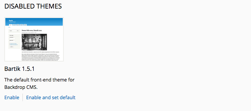
- Enabled themes - lists all themes which are enabled, including the current "default" theme. A default theme is the front-end theme (the theme your site visitors will see

- Disabled themes - themes not in use
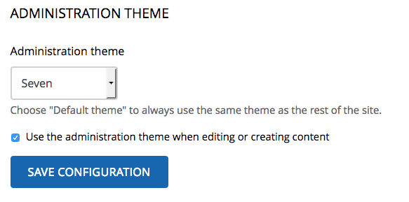
- The Administration theme - the theme used when performing administrative tasks
The theme that is set to Default is the one people will see when they visit your site. Though it is possible to have more than one enabled theme, this is only useful if you are also using a contributed module to adjust which theme is in use.
To set a theme as the new site default, simply click the Enable link or the Enable and set default link (if it is currently disabled).
Theme settings
Some themes will have an additional link for "Settings." This link takes you to a page to configure the theme further; the options vary completely between themes.
Administration theme
In Backdrop, the Seven theme is the default administration theme. The administrative theme is used when performing all administrative tasks, most of which happen under the /admin path. You can also choose to allow the administrative theme to be used when editing site content. Any Backdrop theme can be used as an administration theme if desired.
The administration theme’s configuration settings are located below the theme listings on the Appearance page. To use the same theme on both the front and back end of your Backdrop site, simply choose Default theme as the Administration theme.
Installing a new theme
New themes can be installed by browsing through Install Themes at Admin > Appearance > Install Themes to find available themes on BackdropCMS.org or using the "Manual Installation" option.
Related theme features
One aspect of the site's appearance which is not controlled on the Appearance page is the placement of the site logo, site name and site slogan, and the navigation menu. In Backdrop, these elements are managed as blocks, which are placed in the Layout UI.
The site logo, name, and slogan can be altered by visiting the Site information page at Admin > Configuration > System > Site information.
Color settings
Certain themes allow you to change the colors of multiple elements of your site via a point and click interface. The color settings form has four parts:
- The color palette picker - provides a select list of predefined color sets
- The color sets - a set of textfields for inputting a hex color for pre-determined theme elements such font color or background color
- Color wheel - allows picking a new color by clicking a point on a color gradient
- Site preview - a dynamically updated representation (not an exact representation) of the website front-end.
Choosing a new color set dynamically alters the colors represented in the textfields below the select list. For example, the theme Bartik is color-enabled with seven color sets. Choosing a new color set such as "Mocha" alters the colors in the color sets immediately, and also updates the preview.
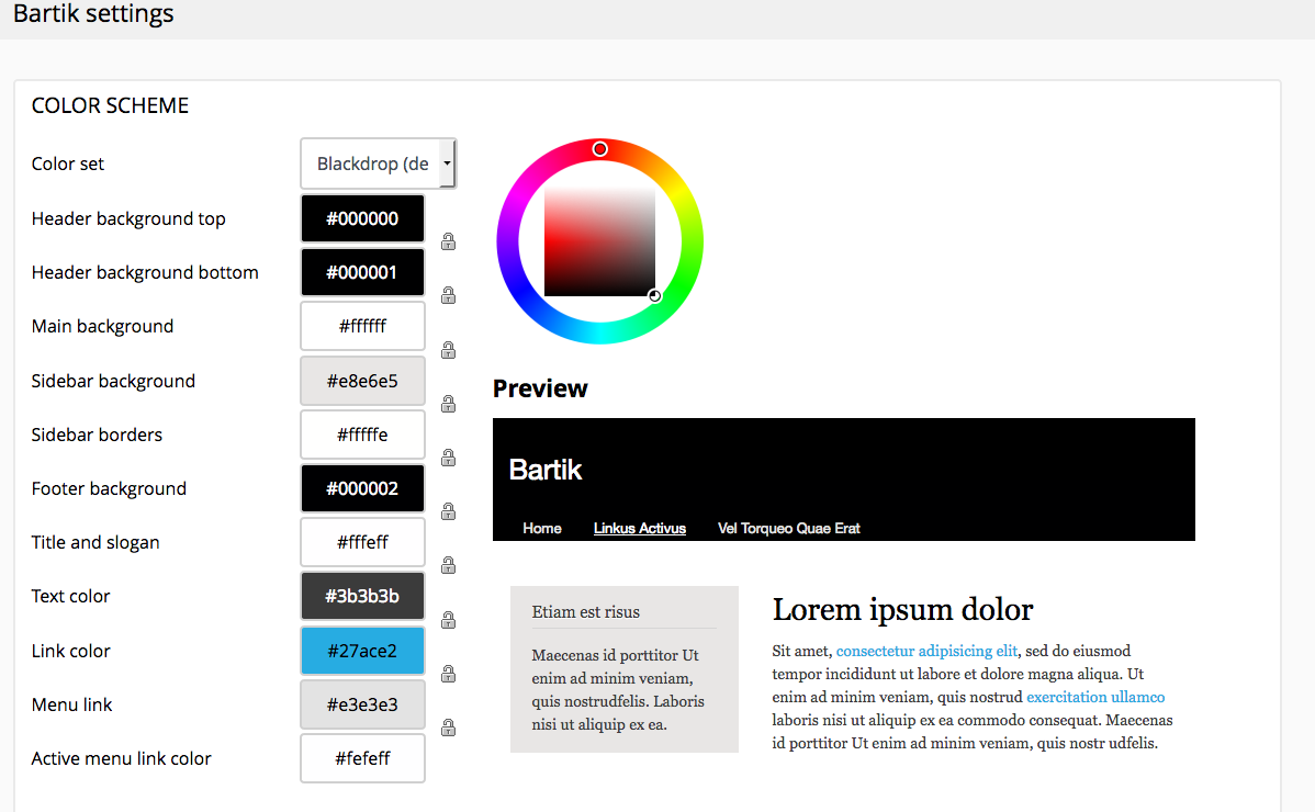
Colors in the color set textfields can also be manually changed, either by typing a hex color into any textfield, or by selecting a textfield (by clicking within it) then picking a color on the color wheel. The preview is also dynamically updated while clicking the color wheel or while dragging the mouse around on the wheel.
The site elements for which the color can be updated will vary based on the theme. For the theme, Bartik, the following options can be changed:
- Header background top
- Header background bottom
- Main background
- Sidebar background
- Sidebar borders
- Footer background
- Title and slogan
- Text color
- Link color
- Menu link
- Active menu link color
Finally, all changes must be confirmed by clicking the Save theme settings button. Often, it may be recommended to also clear the Backdrop theme cache as well. Home button > Flush all caches > Theme registry.